How to use Neutral Colours In Home Decor
Neutral colours in home interiors offer a timeless and versatile foundation that enhances both style and functionality. By thoughtfully integrating these hues, we can create spaces that are serene and sophisticated while allowing for personal expression through textures and accents.

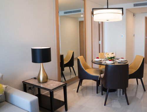
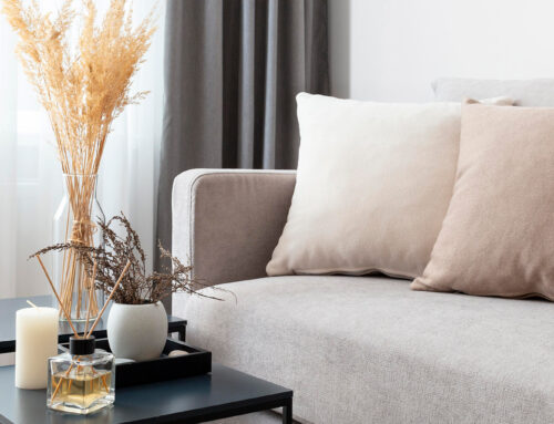
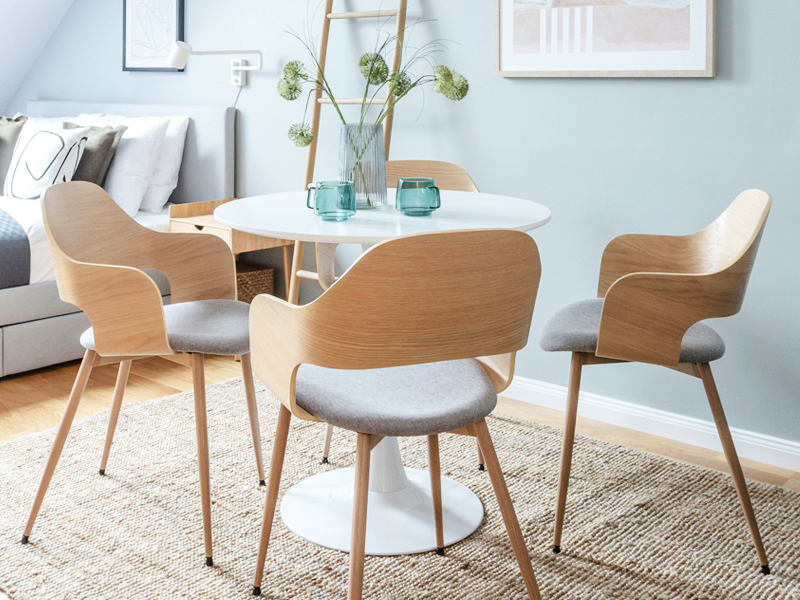
Neutral Colours In The Living Room
In the living room, neutral shades like warm beiges and soft greys set a calming foundation. Adding textured fabrics such as woollen throws and linen cushions provides depth. Incorporating metallic accents like brass or chrome elevates the elegance. A large rug in neutral tones unifies the space, making it feel cohesive and inviting.
Neutral Colours In The Bedroom
For the bedroom, soft whites and cool taupes create a restful retreat. We like to include layered bedding and linen in varying textures to introduce subtle contrast. This contrasted by wooden furniture pieces like a bedside table or a headboard creates balance and warmth. Using serene wall art in muted tones creates a relaxed atmosphere that makes the bedroom feel like peaceful space.

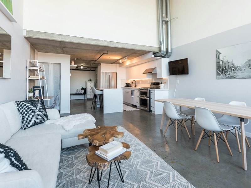
Neutral Colours In The Kitchen
It is important for a kitchen to look and feel clean, so neutrals like ivory and light grey create a clean, modern look. We often advise our clients to paint their kitchen cabinets in these shades to refresh a used kitchen and enhance natural light. Displaying neutral-toned crockery or glassware gives a feeling of cleanliness while suggesting functionality.

Tips For Enhancing Neutral Interiors
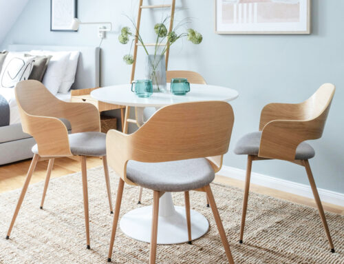
While we love neutral colours, it is important to keep the overall look of the space interesting. The best approach is to look at neutrals as a canvas for creativity, allowing flexibility in style and design while leaving some room to explore with textures and accent colours to elevate and personalise the space effectively.
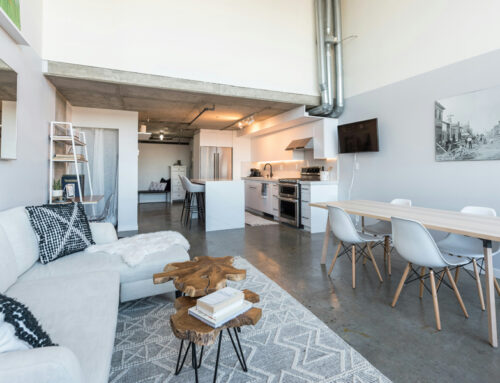
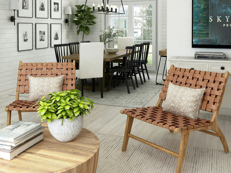
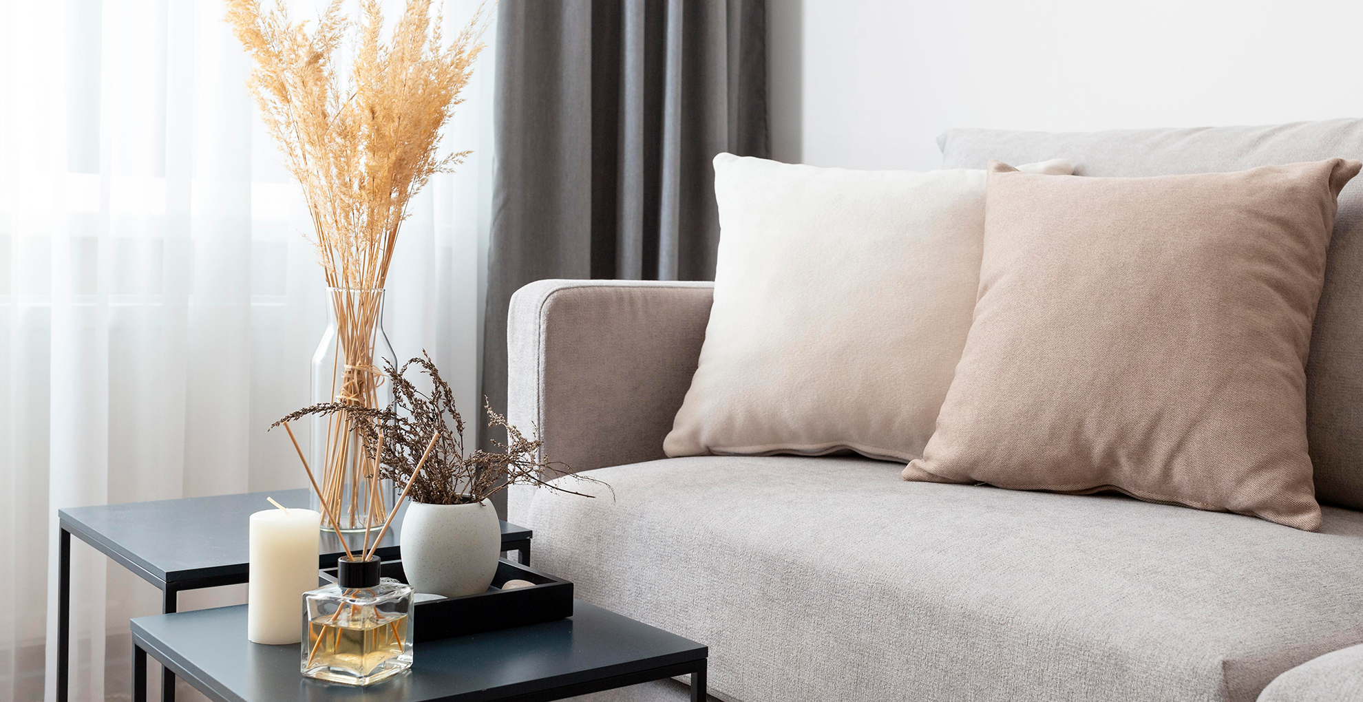
Adding Texture and Layers
Adding texture and layers to neutral interiors brings depth and interest. We use textured fabrics such as linen, wool, or velvet for cushions and throws, to create tactile appeal. Incorporating natural elements like wooden furniture or rattan baskets adds warmth. Rugs with intricate weaves or subtle patterns enhance floor texture, unifying the overall design seamlessly.
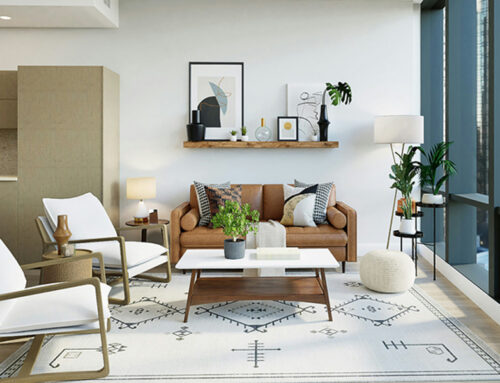
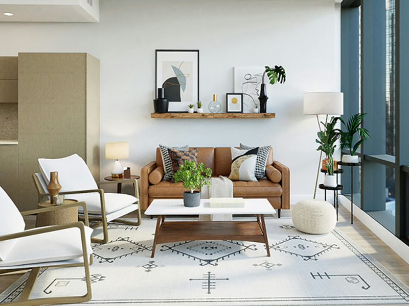
Using Contrasting Accent Colours
Contrasting accents enliven neutral spaces, adding visual intrigue. Introducing darker elements, such as charcoal or navy accessories, creates striking contrast with lighter tones. Metallic fixtures or mirrored surfaces introduce sophistication and reflect light while well considered artwork and decorative pieces in bold colours draw the eye to specific areas of a room.

Common Mistakes To Avoid
When styling with neutral colours, selecting shades that clash is a frequent error. It leads to a jarring look rather than the intended cohesive effect. Many overlook the importance of texture, resulting in flat and uninteresting interiors. A common mistake is using neutral colours excessively, which can make spaces appear cold and stark. It’s crucial to balance neutrals with a mix of textures and accents. Ignoring natural light is another pitfall; it can alter how colours appear, affecting the overall ambiance. Finally, forgetting to add focal points can leave rooms feeling incomplete and lacking character.
